

Inspiration
Good to see you!
Welcome to Dulux
Terms & Conditions
Registration complete
Successfully registered, please login
Registration complete
Forgotten your password?
Please enter email address associated to your account
Change Password
Password changed successfully.
Request sent!
If you have concerns about your privacy?
Read our Privacy Policy.
Delete Account
Glittering Golds
“I’ve read gold is quite a popular at the moment. My living room walls are ready for a refresh, and I’d love to try it out, but how can I make sure it won’t look dated a couple of years?”
Modernising their home is a key decorating trigger for one in five people according to a recent survey from AkzoNobel.
So what better way to brighten up your home, and create a look that’s fresh and current, than by painting your walls with gold, one of our most versatile shades.
Gold is infused with ochre tones, making it bright enough to stand out, yet versatile enough to combine with other shades for a look that’s bold, yet supremely easy to live with.
1. Gold painted office with blue stripes
Blue and gold may sound like an unusual combination at first, but with the right tones it can be uplifting and harmonious.
Here, gold is teamed with warm neutral stripes and a light blue accent colour. These shades site next to each other on the colour wheel and match together beautifully. Varying the size of the stripes adds a playful feel to this study.

2. Pink and gold make a great combination
Dividing your wall in half horizontally is a great way to allow complementary colours to shine and enhance each other.
The soft, luminous quality of the lilac shade here brings out the ochre tones, for a modern look that glows with vitality. These colours work particularly well on a wall that doesn’t benefit from natural light, such as a corridor or hallway.

3. Gold is a welcoming colour
For a welcoming colour scheme combine gold with a light and smooth shade such as cappuccino.
This earthy combination sits harmoniously together, and works particularly well in entrance halls.

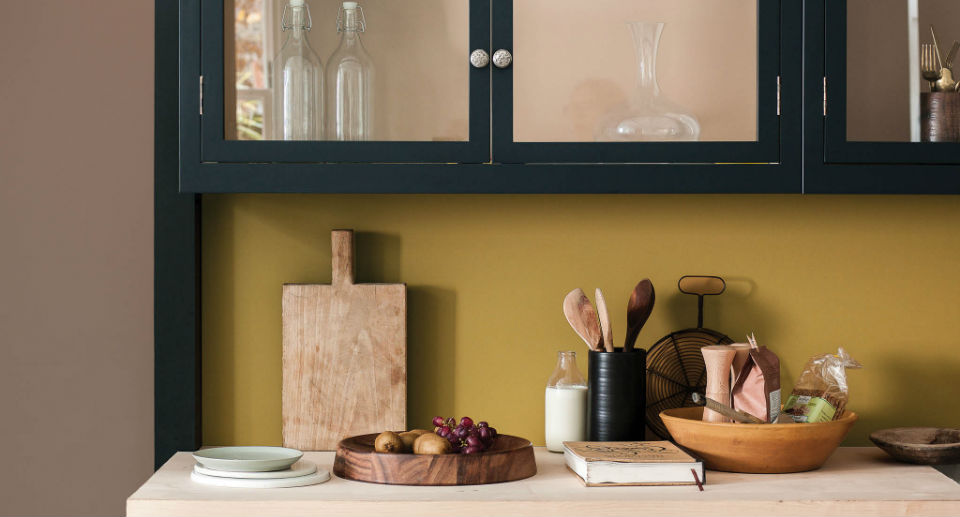
4. Brown and gold kitchen
Dark, chocolaty browns and warm pinks create a pleasing combination that’s full of warmth and richness when teamed with Cherished Gold.
These gentle shades echo the natural undertones of wood, creating a subtle sense of drama when teamed with black accents, like the kitchen cabinetry in the image above.
5. Gold and pale pink bedroom
If cool, Scandi style is you’re thing, then you can’t go wrong by pairing gold with a cool-but-pretty neutral, like pale pink.
This calming and serene combination is perfect for bedrooms, and be sure to accessorise with pale wood furniture to complete the look.
6. Create a glamorous look with gold
Celebrate gold’s glamorous heritage by pairing with a similar muted shade such as mocha.
Add definition with a thin stripe or accent in bright yellow for a traditional look with a modern twist.
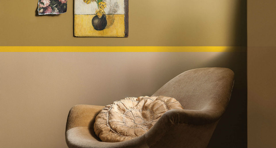
Add drama to your gold scheme with copper accessories, such as a lampshade, or decorative bowl. The reflective, glimmering surface will lift the muted tones of paint, for a look that’s sophisticated, yet liveable.
Add a new job
Add a new job
Edit a job
Delete job
Are you sure? All notes, photos and saved items will be deleted.
Save colour
Save to My Workspace
Save product
Save job


